How to Look: Read the Label Last
This is a question that has been on my mind a great deal this week. I hosted a fascinating Q&A with Nicola Anthony at the opening of her new work at South Mill Arts Centre, and I have also been leading groups around Frieze Sculpture, talking specifically about how we look at sculpture.
I always begin with one instruction: do not read the label.
This process began when I was working with Sean Henry and Osborne Samuel on the Treasure House sculpture walk in 2025. Sean specifically does not like to have his work labelled because he wants us to find his sculptures out in the wild and, at first, feel that they are simply part of the crowd — until we stand closer and realise their scale. For Sean, the label can distract from the feeling a sculpture is designed to create. And, of course, labels are no longer our only route to information: a photograph can now produce an instant account of a work through image-recognition tools.
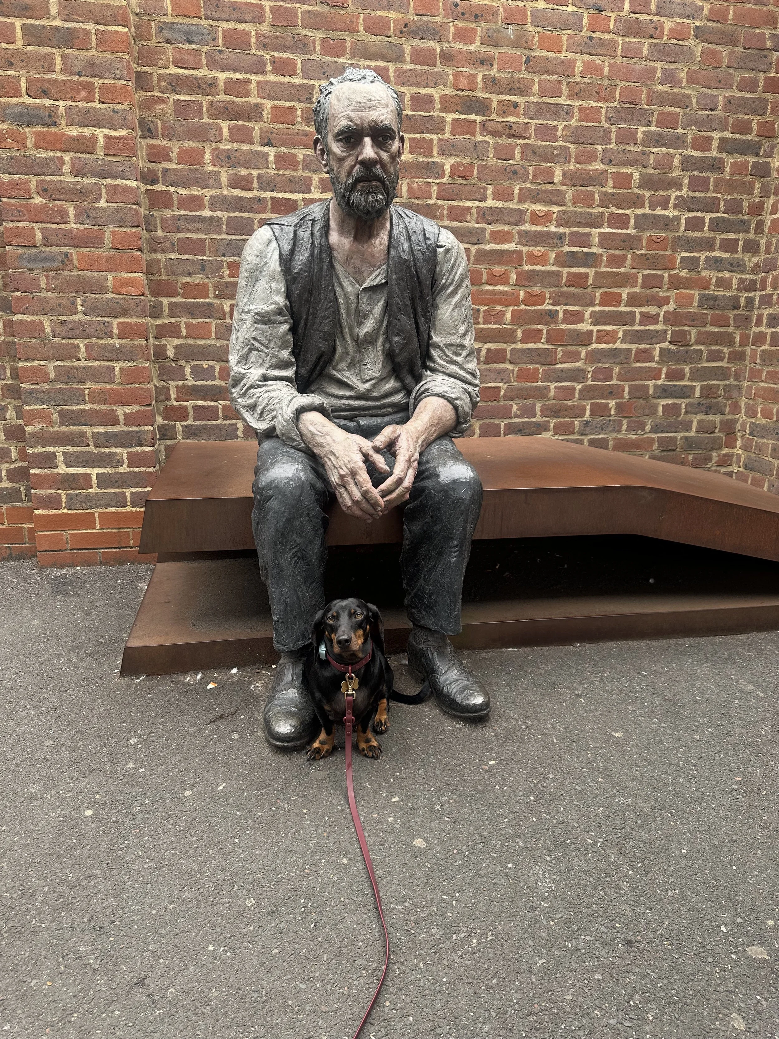
Seated Man, Sean Henry, Woking Station,Harvey Horswell Head of Security.
Pictured is my dog sheltering beneath one of Sean’s works at Woking Station. As you come down the stairs to the platform, you first read the figure simply as a man on a bench. Get closer and he becomes a giant, one my dog instinctively sought out for protection from a completely terrifying chihuahua. He is not very brave. In a funny way, my dog responded to the sculpture before knowing anything about it. That is exactly what I ask visitors to do.
The main reason I encourage people not to read the label first is that the title often explains the work, but it also brings its own influence. You may learn the artist’s gender, generation, nationality, materials and, often, a suggested theme or subject.
For me, this information is most useful after you have formed your own connection with the work, and allowed it to prompt a thought or feeling.
The very best thing about art is how it inspires connection, but also imagination, and often the label hinders this. Reading the label afterwards lets you discover whether the artist has succeeded - with you specifically - in communicating what they intended, while also adding a final layer to your understanding of the work.
For example, Ron Arad’s work in my own Sculpture Walk at Treasure House is pictured below. Play along with me here and view the image first. Think about what it is and what it makes you think of. This is, of course, much harder when we have made a very three-dimensional object two-dimensional.
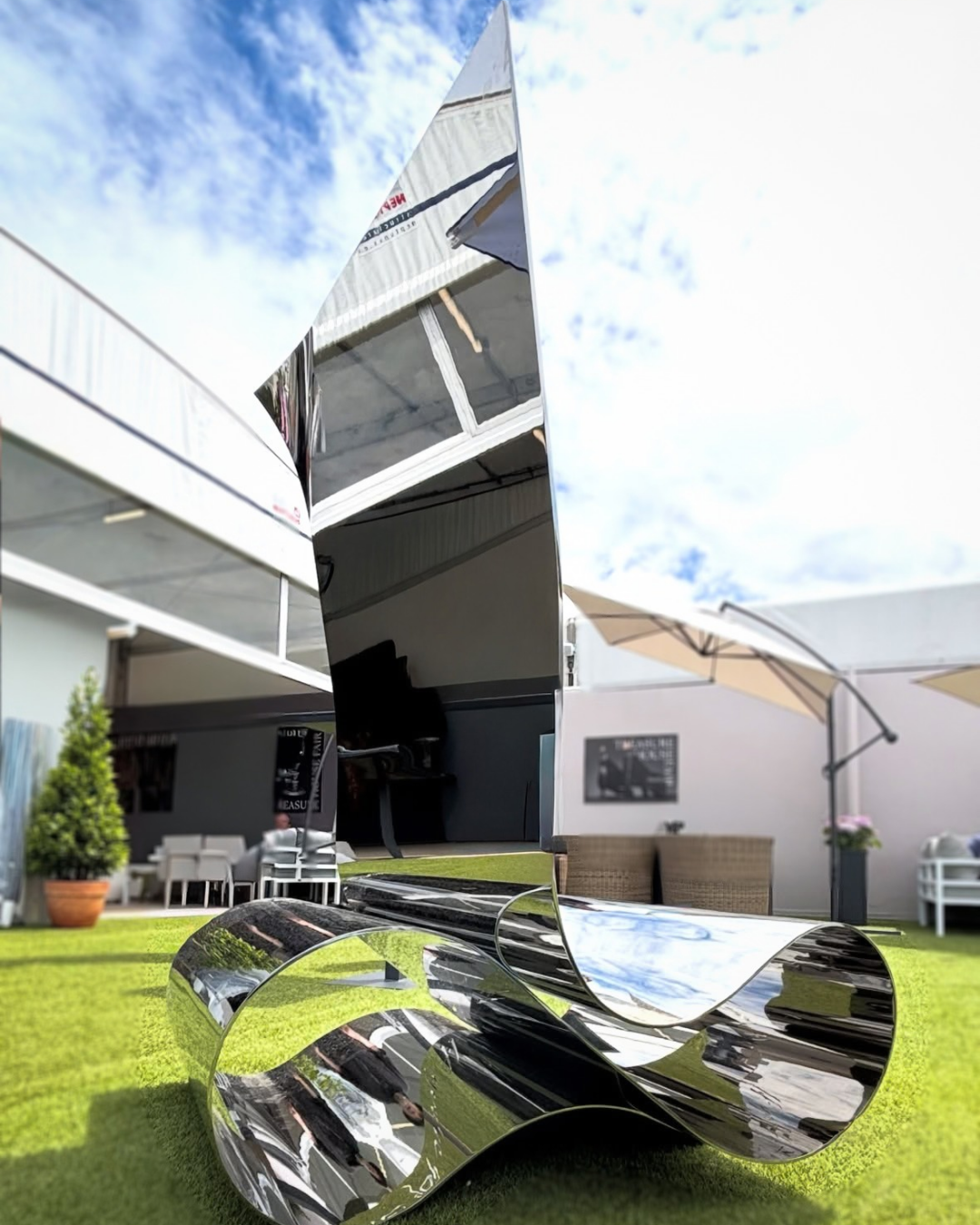
New Page, Ron Arad, brought to the walk by Opera Gallery, image courtesy of ‘Take 5 Comms’.
New Page, Ron Arad, brought to the walk by Opera Gallery, image courtesy of ‘Take 5 Comms’.
This piece is entitled New Page. Suddenly, the idea of the writing and the metal being so flexible connects to paper, and all the associations of the word ‘new’ are brought into how you react to it. The right title can uplift a work, and it absolutely does in this case.
Then, of course, there is knowing more than the label tells you: knowing about the artist and the artist’s intent. Take Angel Otero’s Dreams and Salt at Frieze Sculpture, one of the works I have been discussing with clients and corporate groups. The work presents a partially open door embedded in the ground, with a staircase leading downwards. It becomes an ambiguous threshold: an entrance, an exit or perhaps something less certain. Once you know the title, it changes how you view the ‘threshold’. Then, once you know a little more about the artist, you learn that the ‘salt’ comes from the way migrants travel across oceans, but also perhaps from the tears of those leaving. My own instinctive response to the title was that salt is often used as protection from evil, placed across a threshold to prevent evil from crossing. Would I have had that thought if I had known more about the artist’s intention from the beginning? (I am deliberately underplaying Otero as an artist, as I have no doubt that association was also a factor in a work about thresholds.)
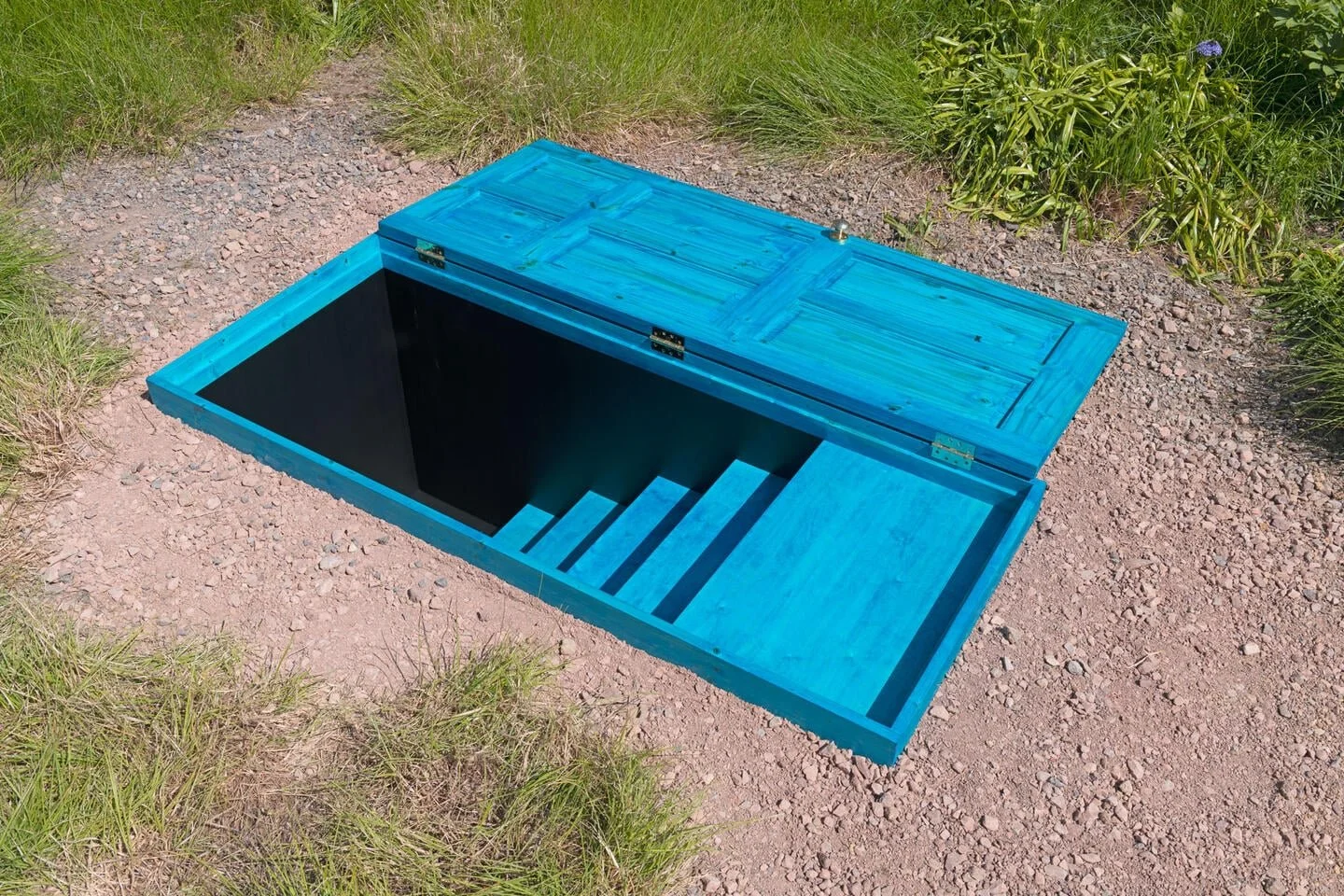
Courtesy the artist and Hauser & Wirth / Frieze (my own images have all the health and safety barriers needed for a work like this in a public park).
However, we mustn’t forget that, for some viewers, the label has to be read first. This is often about how our brains work, and it is interesting to discover which kind of viewer you are. For the “label first” viewer, an understanding of intention may be the thing that allows personal interpretation to take flight.
As I always want to make clear - even here - there are no rules about how you view or respond to art.
There is also another kind of information contained on the label: the name of the gallery presenting the work. For those of us familiar with the art world, this can be difficult to ignore. In a group exhibition, the gallery may affect how we understand an artist’s commercial position, value or future. Does the status of a gallery make an artist or work more worthy? For me, the answer is no. But for collectors, representation can be relevant when considering support, provenance, resale and long-term visibility. There can be reassurance in acquiring through an established gallery. Its infrastructure may make everything from acquisition to delivery and installation feel straightforward. Yet there is also the collector who wants to collect a work on its way up, who enjoys the risk of an uplift, and in that case the level of the gallery might influence your ideas of future growth.
So, before we have properly looked at a work, one small label can tell us its title, the artist’s gender, age and nationality, the materials used, a possible subject and the artist’s commercial context. That is a great deal of information to bring to something you have not yet had the chance to experience for yourself.
The label is a complicated proposition, and artists relate to it in very different ways.
For some viewers, context is the key that opens the work. For others, it can close down a first response before it has had room to develop.
For me, I will always ask you to read it last.
Look at the work first. Then pick up the key.